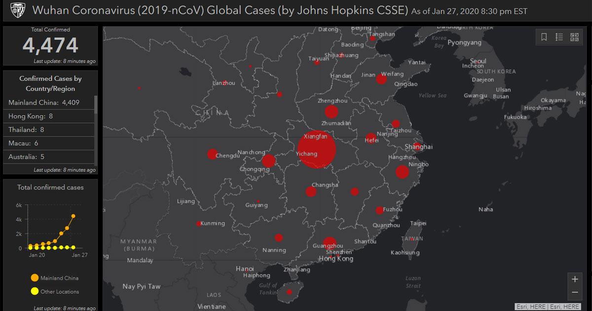
Researchers at Johns Hopkins University have produced a map to track and visualise reports about the outbreak of the Wuhan virus.
Using data from the Centres for Disease Control and Prevention, the World Health Organization, China's CDC, and other sources, the map is supposed to reflect cases that emerge in real-time.
Each red dot represents an outbreak.
The size of the dot corresponds to the relative size of the outbreak.
Clicking on one shows the region's information.

A chart also shows the pace of the virus spread in mainland China compared with the rest of the world.

While the map is supposed to be updated in real-time, it failed to register the two new cases reported in Singapore on Jan. 28, 2020.
Two hours after the news about the sixth and seventh confirmed cases were reported in Singapore, the tally by the map did not register any changes.
While health officials have said they think this coronavirus is not as lethal as SARS, at least 12 cities in China have imposed travel restrictions, affecting an estimated 33 million people, while Wuhan has been quarantined.
Content that keeps Mothership.sg going
✈️?
We compiled a list of food, flight and activities promos for you.
??
$1.50 unagi sushi?!? Don't say we bojio.
??
Technology can be scary for older folks, but it doesn’t have to be.
If you like what you read, follow us on Facebook, Instagram, Twitter and Telegram to get the latest updates.
