We all love a good deal. Who doesn’t?
But when something is too good a deal, it probably is.
It’s true, half truths are as prevalent as a degree-holder in Singapore. Don’t get us wrong, terms and conditions are absolutely essential. But more often than not T&Cs are used to hide caveats when advertisements don’t paint the full picture.
Here are some examples.
1. *,^ and other superscripts
You will most definitely find this little bugger → *. Or this → ^. Or some other superscripts floating all over the shop in ads.
Indeed, these superscripts are essential stuff for most banks – almost like how MSG is for restaurants. But for us consumers, instead of mind-exploding flavours, what we are left with is a bitter taste in the mouth.
2. Must jump through hoops
Many hoops. Too many hoops in fact.
Hoop 1: Wanna get your reward worth $X every month? You must first spend <$X every month.
Hoop 2: Be the first 100 customers to spend <$X on the first calendar day of the month.
Hoop 3: You must spend <$X on a single receipt.
Hoop 4: Cannot use supplementary cards.
Hoop 5: Cannot use other cards from the same bank.
All the hoops make us wanna do this:
Just be a little upfront and honest with us poor people can?
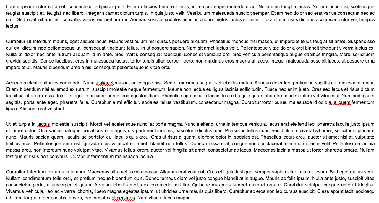
3. Walls of text and confusion
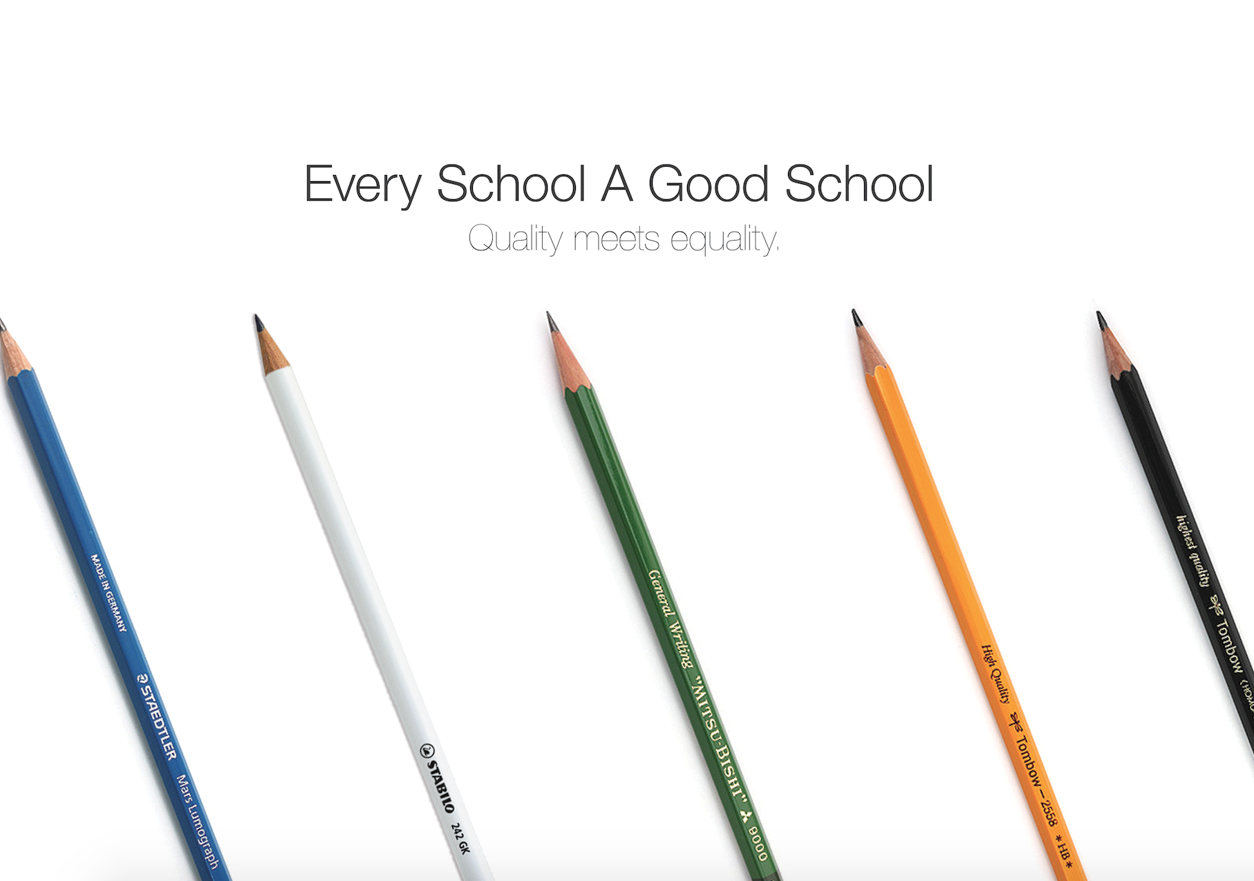
This is what a typical ad might look like - simple, clean …
And this is how typical T&Cs look like:
Which makes us go:
If you take time to go through every single word, you will discover the lost art of using unwieldy words like “henceforth” and “aforementioned”. Forsooth.
4. Font size 6
Speaking of presentation, they also usually look a lot like this:

Did we sign up for an eyesight test?
--
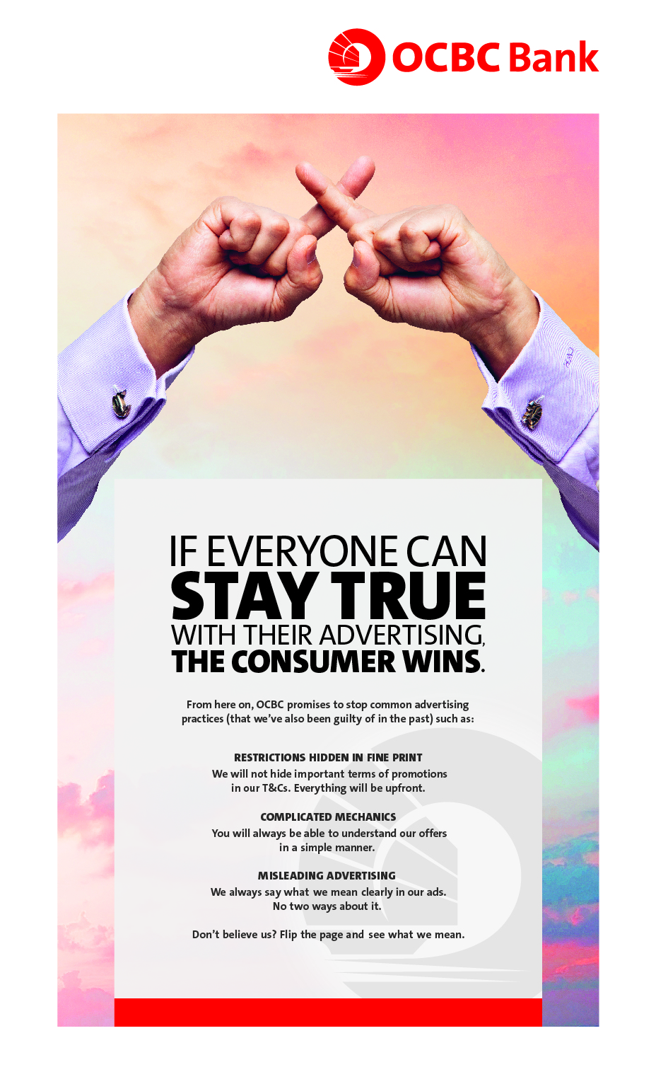
That said, this new ad by OCBC promises to cut the BS out of their ads.

OCBC ran a truth advertising campaign called Stay True, and aims to promote truthful advertising to their customers. How? By keeping things upfront, transparent and saying goodbye to misleading text in their ads.
And to back it up, this lau jiao OCBC banker sat through a lie detector test:
Truth be told, T&Cs will still exist but if they are more administrative than restrictive, then it’s good news for the industry, and for consumers.
So here’s hoping for fewer BS in ads in the future.
Top image via
This post is sponsored by OCBC, who says we need to cut out some of our BS too.
If you like what you read, follow us on Facebook, Instagram, Twitter and Telegram to get the latest updates.

