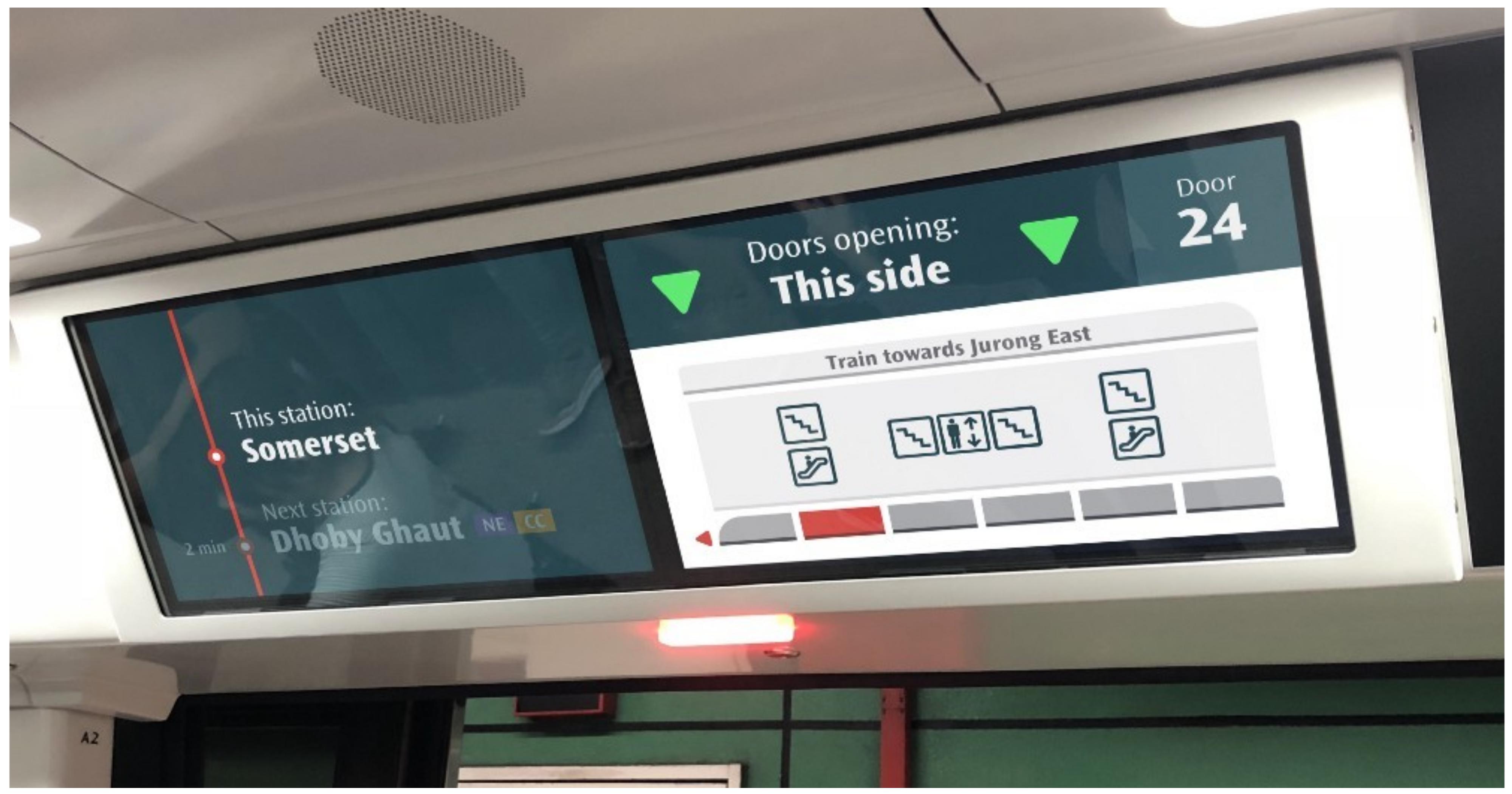
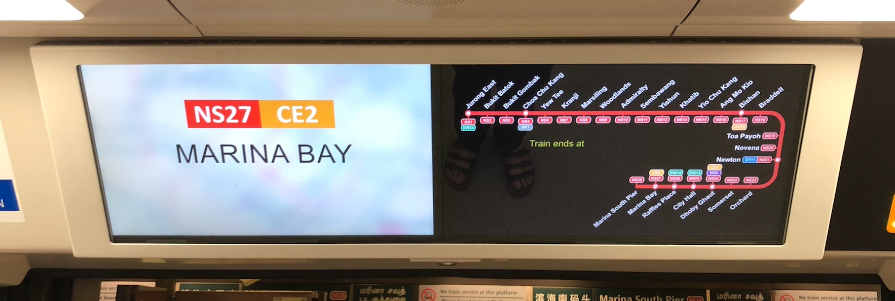
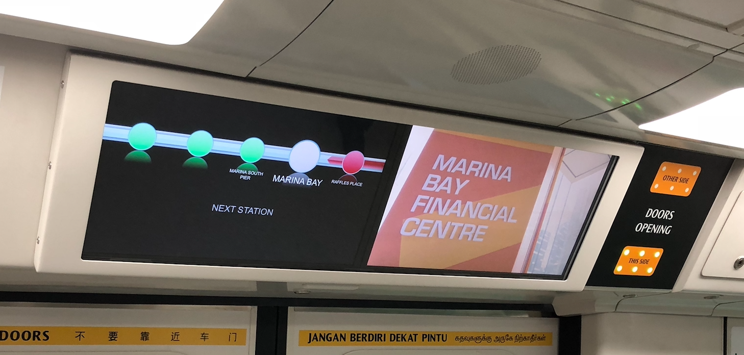
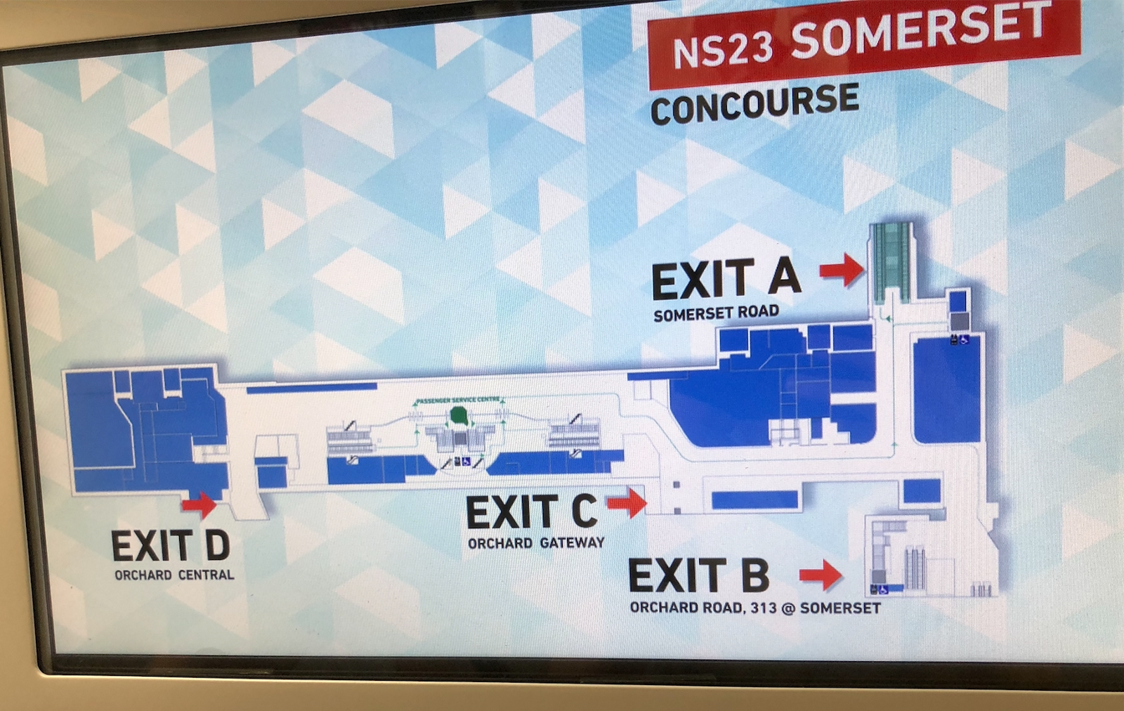
Here's the current MRT train display.
After carrying out research with consumers, Reassemble, a user experience (or UX) consultancy based in Singapore, proposed some alternative designs to improve it.
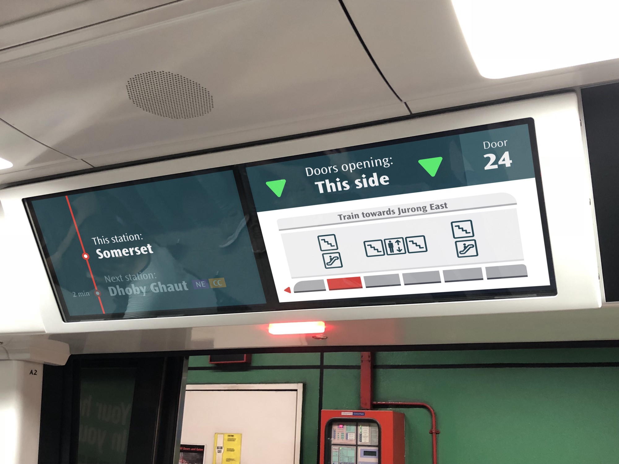
Here's their proposed design shift.
Here's why they think their designs works better for the average passenger:
Current design
To improve on the current design, the team at Reassemble focused on what consumers wanted from a display, here are the two main things:
- Find out where they are.
- Find out how far they are from their destination.
They found that while the screens do showcase this information, it is neither intuitive nor immediate, which is what passengers want.
Here are some other issues Reassemble found with the screen, which can basically be summed up as being too cluttered.
[related_story]
1. Unnecessary images
The scenery of landmarks around the station was considered unhelpful because locals would know the places, and tourists would have no use for pictures of office buildings.
2. Station names are smaller than the indicator dots
3. Confusing station maps
Their proposed redesign
The redesign was based around these four principles:
- Showing essential information
- Simplifying information
- Clean screen transitions
- Beautify the screens with SMRT colours and fonts
Here are their redesigned concepts.
In case there are train disruptions:
A typical suggested display:
Note the information on whether the doors are closing, as well as the more streamlined, icon-based directions to exiting the station.
And here's what they envision it looking like on an MRT display screen:
And here's how it will hopefully look like in practice.
Marina Bay – Marina South Pier from Hello Reassemble on Vimeo.
Somerset – Dhoby Ghaut from Hello Reassemble on Vimeo.
You can read more on their Medium article here.
All images from Reassemble's Medium article
If you like what you read, follow us on Facebook, Instagram, Twitter and Telegram to get the latest updates.
