
As an embodiment of concepts and values of the organisation or event it represents, a logo is pretty important and tough work.
While most Singaporeans tend to notice the annual National Day logos and even Singapore Tourism Board's latest "Passion Made Possible" campaign logo, the Budget logo however, is less well-known.
Indeed, there is a logo for the Budget.
Four hearts, salmon pink
This is the logo for this Budget 2018:
![]() Photo from Budget 2018 website.
Photo from Budget 2018 website.
According to the Budget 2018 website,
"The warm shade of salmon pink represents our pursuit of a caring and inclusive society, where Singaporeans are free to pursue their dreams and aspirations.
The four hearts come together to form the logo that symbolises a united Singapore, undivided by our differences and bonded by a common determination to overcome challenges ahead. The family at the centre reminds us that our families and friends will always be at the heart of what we do, no matter how far we progress as a nation."
If by chance you find this familiar, that's likely because it's the same as the logo for the past two years as well.
The same since 2016
Here's 2017's, which comes in a shade of purple:
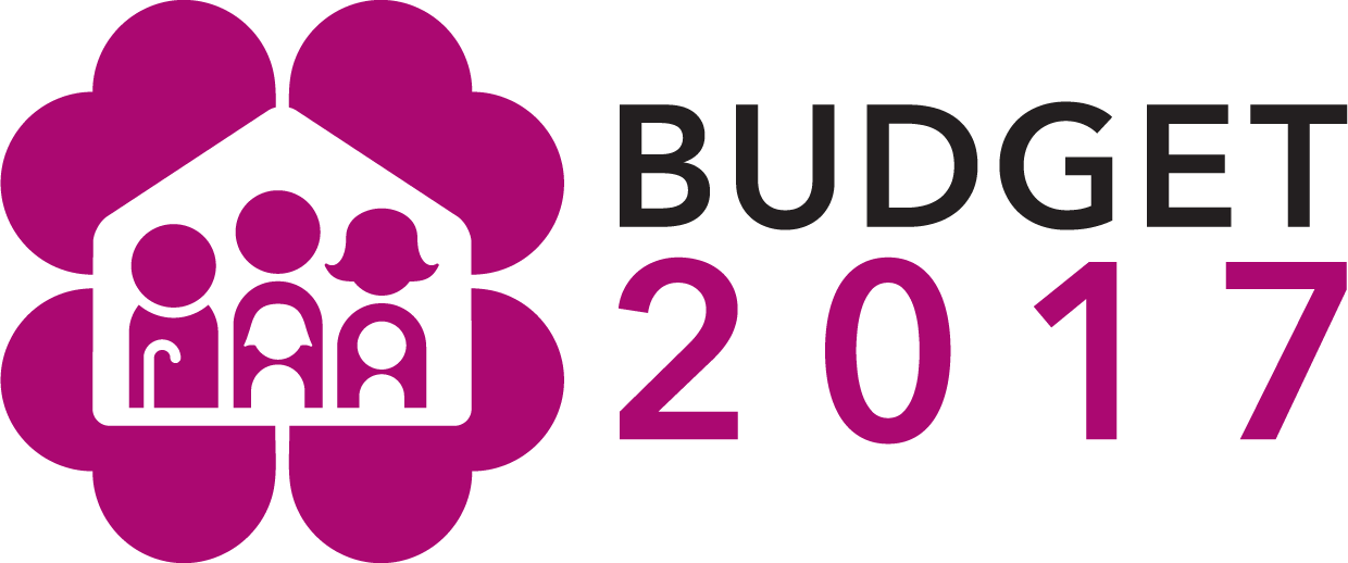
Unfortunately, there are no official explanations for the Ministry's choice of purple, but yes — it's a new number and colour from the Budget 2016 logo, which looks like this:
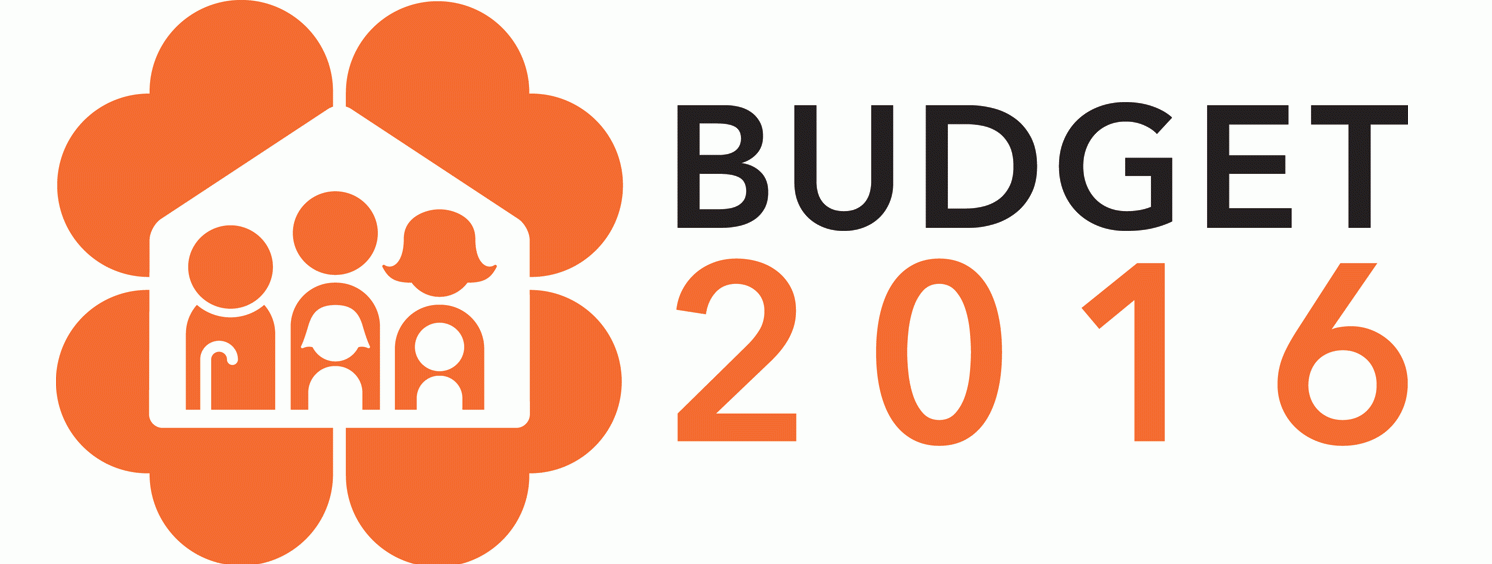 Photo from Budget 2016 website.
Designed by Singapore Polytechnic student Toh Ping Huang, it was the first time the Ministry involved students in the design of the Budget logo as they wished to ignite curiosity among the youth to learn more about the Budget process.
According to Toh's explanation, the four hearts "represent a united nation working together towards a better future for our loved ones, and progressing as a nation."
He designed it originally in orange, a colour he chose for youth, enthusiasm and vibrancy.
3 of the same, and 3 of the same
Here's something even more fascinating — the three years preceding 2016 through this year also had three strikingly similar logos.
Here's 2015's:
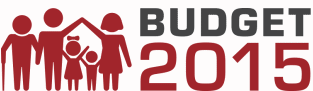 Photo via Budget 2015 website
And here's 2014's, which had a slightly different font and style, with an extra bottom bar. Details on the figures were also omitted in 2015's.
 Photo via Budget 2014 website
[related_story]
The inter-generational family of five — parents, children and a grandparent — is a feature in the Budget logo that persists even up until today.
This feature, probably to signal greater inclusivity, only began from 2014 onwards.
Even though the Budget 2013 logo bears a striking resemblance to the logos of the two years that followed, a family of four, and not five, was included:
 Photo via Budget 2013 website
It's an interesting trend we can't quite explain: MOF appears to be coming up with a new logo and retaining it for the two years that follow, and then doing it again for the next three years. In both these three-year periods, it made just minor adjustments to its design.
As this current logo has already been used three times, we reckon we'll quite likely see a change next year.
Top photo adapted from Budget websites 2013-2018.
If you like what you read, follow us on Facebook, Instagram, Twitter and Telegram to get the latest updates.