Poor NTU can't seem to catch a break. After opening a matriculation card design competition to students, the school received over 500 entries. Out of the 500, the school shortlisted three designs, but students on the NTU Facebook page don't seem to be taking well to them.
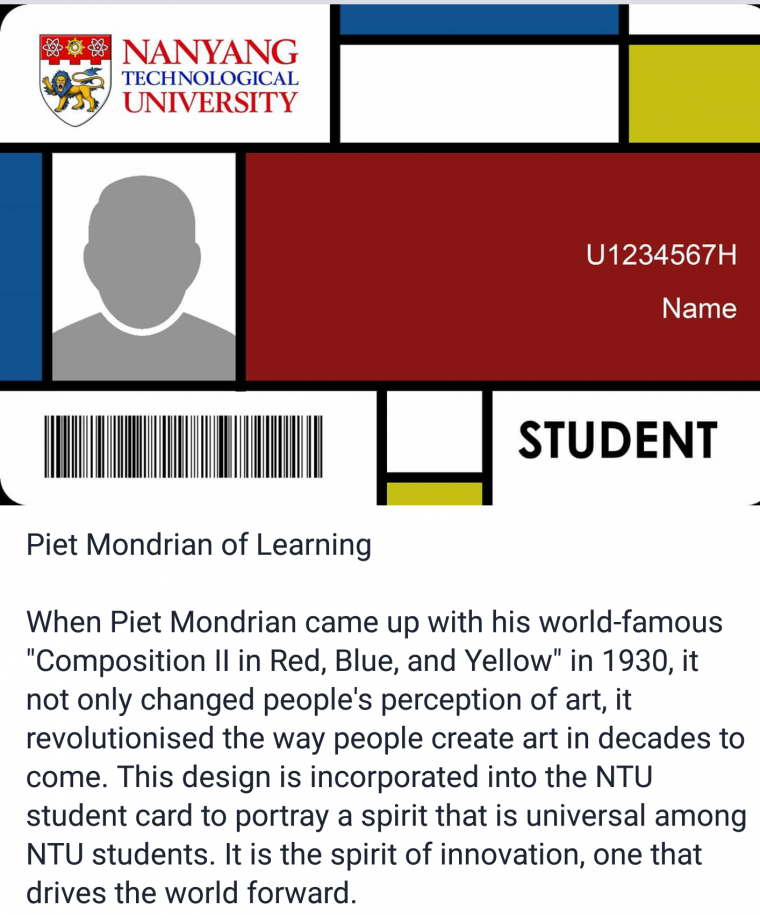
Out of the three shortlisted designs, one seems to be a inspired by Piet Mondrian's abstract works, and one seems to be in breach of the school's logo usage guidelines.
ripoff
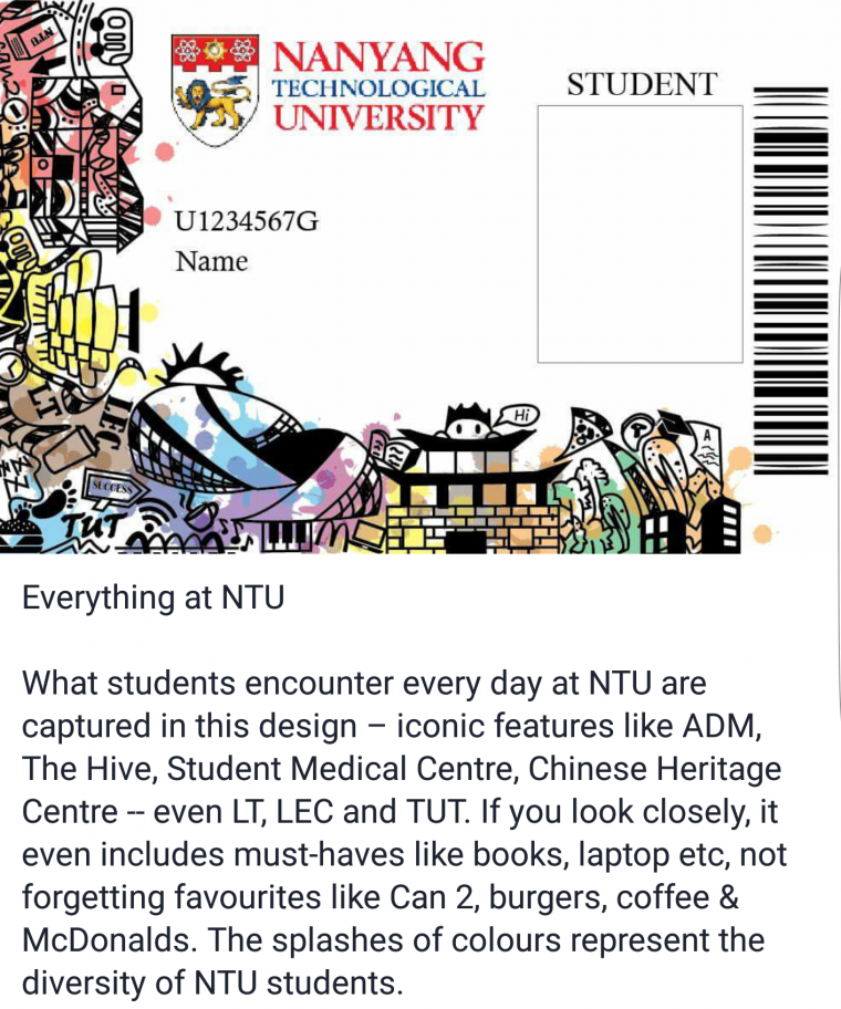
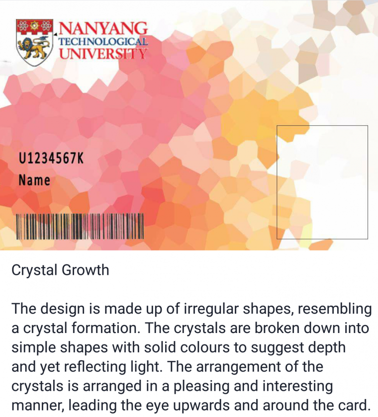
Here are the three designs (which you can find in this NTU Facebook album) with accompanying concept statements.
"Everything at NTU"

"Piet Mondrian of Learning"

"Crystal Growth"

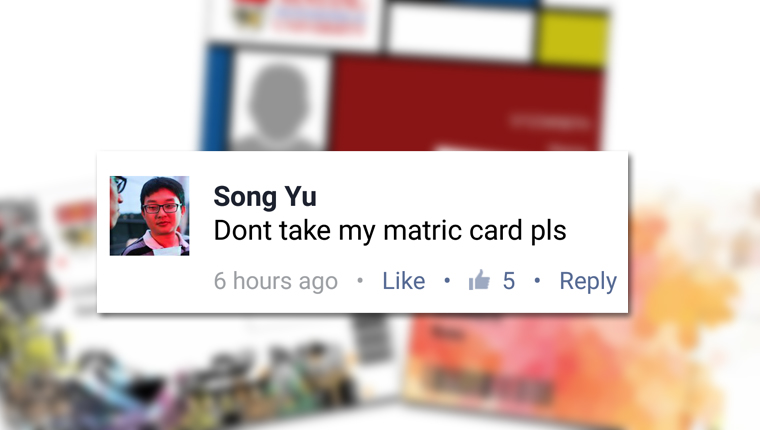
Students made it very clear they really don't like these designs. Here are our favourite comments:


On the other hand, a Facebook user has been collecting rejected designs and uploading them onto a Facebook album. At the time of writing, there has already been 22 entries in the album.

Students have until 7 November, 12pm to vote for the winning designs. Guess we'll wait till then to see how this turns out.
All photos from Facebook.
If you like what you read, follow us on Facebook and Twitter to get the latest updates.
If you like what you read, follow us on Facebook, Instagram, Twitter and Telegram to get the latest updates.
