Follow us on Telegram for the latest updates: https://t.me/mothershipsg
Australia's government has been left red-faced after a recent rebranding exercise resulted in a rather incongruent logo for the Prime Minister and Cabinet Department's (PMC) Women's Network.
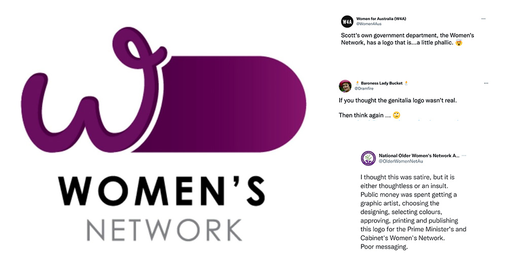
The design in question featured a "W" placed next to an innocuous-looking purple dome.
Yet taken together — accounting for the W's curved font style and the elongated shaft leading to the dome — the Women's Network logo appeared somewhat, well, phallic.
According to a description on the PMC's website, the Women's Network is amongst a number of initiatives focused on fostering "a culture where everyone feels valued, safe and included at work".
"Thought it was satire"
Unsurprisingly, the gaffe was quickly pointed out on social media after it appeared on the department's careers website in March, reported ABC News.
https://twitter.com/AmyRemeikis/status/1502896136222240770
If you thought the genitalia logo wasn't real.
— 🕯 Baroness Lady Bucket 🕯️ (@Dramfire) March 13, 2022
Then think again ... 🙄https://t.co/bANKDRglG9 pic.twitter.com/JuVj3YXYaE
Scott's own government department, the Women's Network, has a logo that is...a little phallic. 🤯
— Women for Australia (W4A) (@Women4Aus) March 13, 2022
You couldn't write this!#auspol #womensnetwork pic.twitter.com/cmKw6DhA31
Among its critics was the National Older Women's Network Australia, a group that advocates for the rights of older women.
"Poor messaging," decried the group on Twitter.
"I thought this was satire, but it is either thoughtless or an insult."
I thought this was satire, but it is either thoughtless or an insult. Public money was spent getting a graphic artist, choosing the designing, selecting colours, approving, printing and publishing this logo for the Prime Minister's and Cabinet's Women's Network.
— National Older Women's Network Australia (@OlderWomenNetAu) March 13, 2022
Poor messaging. pic.twitter.com/jDYKNdMCkg
Part of a rebranding exercise
In a statement, the PMC said that the logo was conceived after a 2019 rebrand of staff diversity networks “to establish a consistent look and feel” between insignia for groups including the women’s network.
The department explained that the W had been retained as part of the logo as it had been used by the network for years.
"The rebrand was completed internally, using existing resources, and designs were consulted on widely. No external providers were engaged for this work," said the department.
It added that neither Australia's Prime Minister Scott Morrison nor his office were involved in the rebranding.
One user on Twitter, who offered her take as a graphic designer, pointed out that the logo was in keeping with the other logos for networks in the PM&C.
2. Whoever designed this “Women’s Network” Logo looks like they had to keep it the same shape as 5 other logos for consistency. My experience tells me they probably a limited amount of time to design all of them as well. pic.twitter.com/9EhEHKfok0
— JenBNE (@BneJen) March 14, 2022
"My experience tells me they probably [had] a limited amount of time to design all of them as well," she wrote.
The logo has since been removed by Australia's government.
Follow and listen to our podcast here
Top image from Twitter
If you like what you read, follow us on Facebook, Instagram, Twitter and Telegram to get the latest updates.