Logos in Singapore are often revamped or rebranded without us even noticing.
Take, for example, this old but gold one from Singapore Pools.
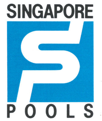 Singapore Pools logo (1988)
This logo, if you haven’t noticed, was given a facelift in 2016 to look like this:
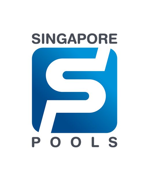 Photo from Singapore Pools' website
Designed by freelancer
The original logo, by the way, was designed by freelance graphic designer Berwin See.
He graduated from the Nanyang Academy of Fine Arts.
See is also the designer of the logo for the then Bishan Serangoon Town Council:
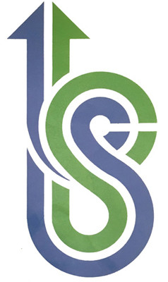 Bishan Serangoon Town Council (1991)
The logo integrates the lower case “B”and “S” -- which stands for Bishan and Serangoon respectively — to represent the unity of the residents.
In 1991, he also designed the logo for Holland Town Council (which is now part of Holland-Bukit Panjang Town Council):
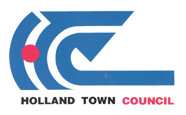 Holland Town Council (1991)
This red-and-blue design, if you look carefully, incorporates the town council’s initials: “HTC”.
Negative spaces and arrows
Design junkies would probably notice See’s distinct style, which often uses negative spaces to form an intended shape for the logo.
The more observant will also realise See’s penchant for arrows, which he uses to represent “forward-looking aspirations” for the town councils.
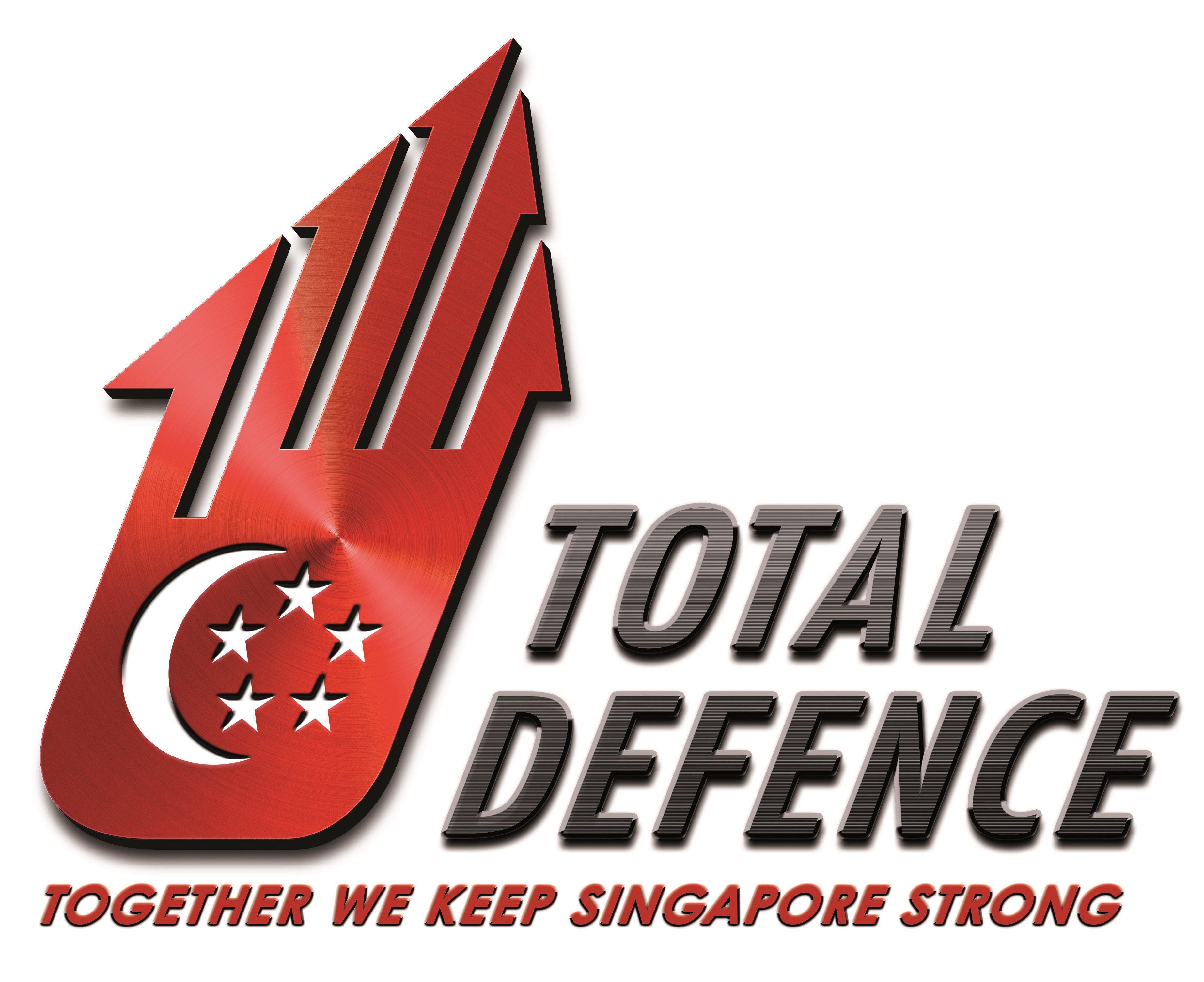
Iconic Total Defence logo
And speaking of arrows, See designed the winning entry for the Total Defence Logo Design Public Competition in 1985.
Among 1,700 other entries, his design was shortlisted into the top 12 by a committee that comprised defence personnel and representatives of various art schools.
It then won the hearts of the public who were invited to rank the 12 shortlisted entries.
The logo consists of five arrows, each representing the five pillars of Total Defence: Military, Civil, Economic, Social and Psychological Defence.
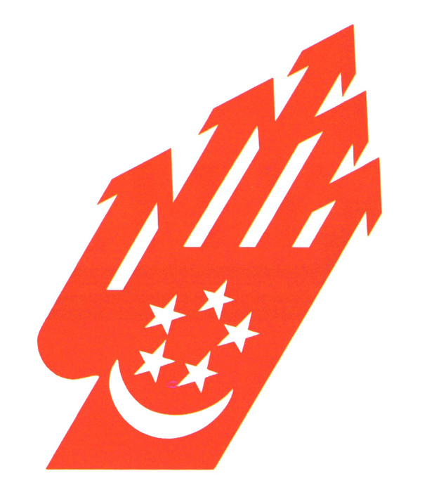 Total Defence (1985)
It also resembles a hand to denote the need for action in the defence of the nation.
See apparently took a month to research for this competition and took “only a few hours” to complete the logo.
Impressive.
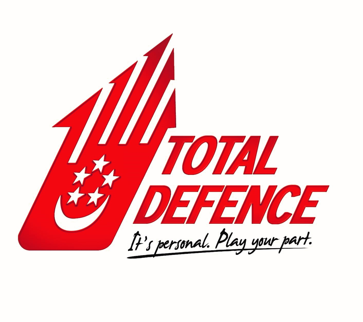
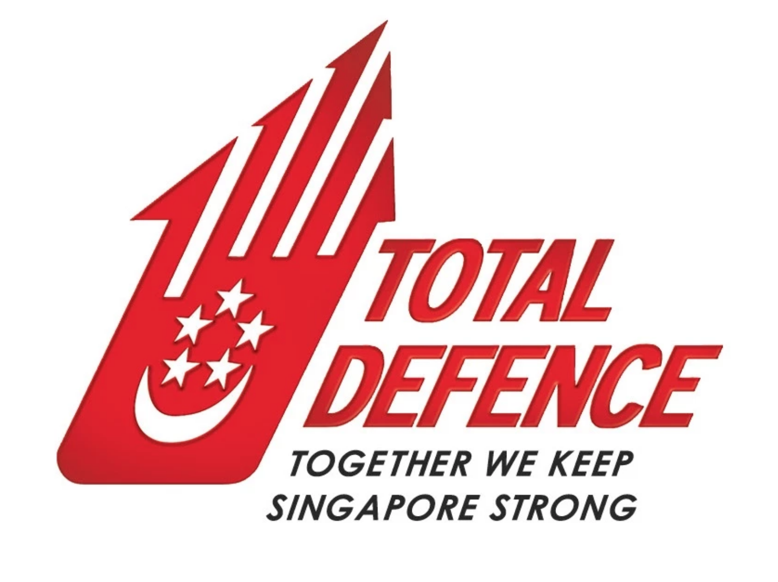
Over the next 20 years, the logo has evolved to fit with the times.
The design of the hand, however, remained an integral part of the logo.
 Total Defence (2009)
 Total Defence (2016)
 Total Defence (2017)
Iconic.
Choose your favourite Total Defence logo
However, the logo will be changing soon to include the newest sixth pillar: Digital defence.
For the uninitiated, digital defence aims to guard against threats from the digital domain.
10 design entries have made it to the final selection and you can choose the newest logo for Total Defence.
You can pick your favourite design here and if you’re lucky, you could win cash vouchers of up to S$1,000 or a pair of Cathay Cineplexes movie vouchers.
The contest ends Dec. 29, 2019.
This sponsored article by Total Defence has made the writer scrutinise logos even more.
Top image from graphics.sg
If you like what you read, follow us on Facebook, Instagram, Twitter and Telegram to get the latest updates.