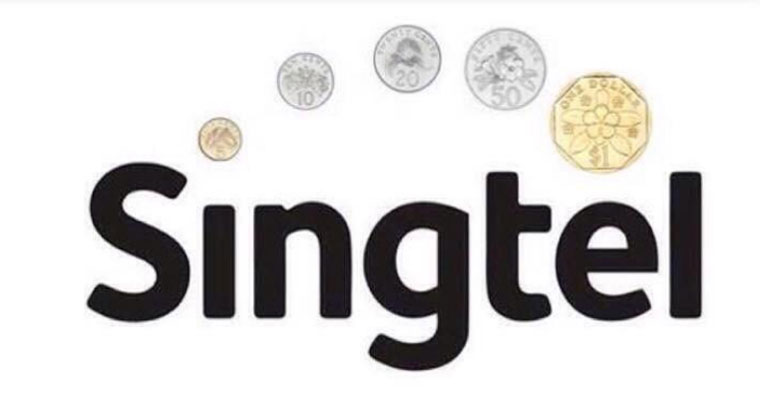
Local telco Singtel unveiled their new logo recently, attracting a flurry of attention.
Even though trade publication Marketing Interactive reported that brand experts said the new logo was better than the old one, that did not stop many from having a little fun.
Here's some that we found:
Each circle representing the blood that I cough up dealing with #Singtel pic.twitter.com/Yc6h2fXaB6
— FunkShin (@funkshin) January 21, 2015
We say: Sounds like tuberculosis, bro. Better get that checked. This has serious health implications.
The 5 dots on the new #Singtel logo will change with the level of signal reception. I have 3-dot reception now. pic.twitter.com/wngBlhSOLL
— gurmit singh (@gurms) January 21, 2015
We say: Well played, Phua Chu Kang.
https://twitter.com/Carminroses/status/558268760046313472
We say: This picture, originally posted by Facebook User CW Ang, takes the cake.
And here's what we imagined other companies would be like if they took a page out of Singtel's book.
Local Telcos: M1, Singtel and Starhub
Justification: It makes perfect sense that M1 and Starhub would use the same Singtel arc that "reflects innovation and the ongoing evolution of the business."
Local Banks POSB, DBS and UOB
Justification: Want to see your fortunes grow? Circles represent unity and family, an (allegedly) important feature of asian societies. Therefore, the increasing size of the circles not only symbolises the flourishing of your fortunes, but also the growth of your family and relationships.
Local Universities SMU, NUS and NTU
Justification: With a world-class education system, students from our local universities will be able to help Singapore achieve the ideals of democracy, peace, progress, justice and equality. Why else would there be five circles?
Health organisations Tan Tock Seng Hospital and the Health Promotion Board
Justification: In case of TTSH, when people become healthier, they slowly become less dependent on the hospital, able to lead a meaningful life after being discharged. Similarly, the HPB logo shows people excelling with their healthy lifestyle.
Government bodies MDA and CSC
Justification: MDA's multi-coloured arc shows their dedication for a media industry that caters to multiracial Singapore. On the other hand, perhaps the Civil Service College offers courses in basketball.
Singapore Slingers & Singapore Swimming Association and Lions XII
Singapore Slingers: Five players enjoy the grand sport that is basketball at a time. If you look carefully, the lion is performing a slam dunk with its right paw.
LionsX11: Reflecting their recent performance, the LionsX11 logo now includes five circles on the side. This symbolises the number of players that are performing their best in the field at any given time. This is a allusion to the club's birthday on 5 December 2011.
Singapore Swimming Association: The addition of the arc is a testament to the swimming prowess of our athletes. The circles show the swimmer performing the breaststroke leaving the rest of the competition behind. Either that, or they don't shave their armpits (which is nothing wrong, by the way).
SMRT and SIA
Justification: Two returning arcs on both SMRT and SIA symbolise two-way safe journeys.
Political Party Logos: Singapore Democratic Party (SDP), People Action's Party (PAP), Worker's Party (WP) and Singapore Democratic Alliance (SDA)
Ah, here comes the fun part.
SDP: Each circle represents the number of times party leader Chee Soon Juan has held a protest, been sued or was barred from running in the General Elections. For Chee's sake, we hope the number of circles do not increase. (Mainly because the logo will be more cluttered than it already is.)
PAP: Each circle represents the party's five decades in power. Each one is larger than the former signifying the rising cost of living in Singapore since its independence 50 years ago. It is unknown if there will be a sixth one.
WP: The arc brings the movement of the hammer to life– The Worker's Party believes in moving towards a first world parliament and coming down hard on single-party politics. However, it is unknown whether the small circles denote the decreasing impact of its MPs after Low Thia Khiang and Sylvia Lim.
SDA: SDA's logo is a star being propelled up by 5 fuel cells. Each cell is smaller than the last, which represents the party's diminishing fortunes in electoral results. The party's loss in the 2013 Punggol by-election set a record for the lowest percentage garnered in an election since the independence of Singapore. Lower than 0.57% next time?
Hey, this isn't so bad after all.
Related article:
Everything you need to know about Singtel’s new logo in 60 seconds
Top photo via
If you like what you read, follow us on Facebook and Twitter to get the latest updates.
If you like what you read, follow us on Facebook, Instagram, Twitter and Telegram to get the latest updates.


