Not sure if you guys noticed, but this happened after every Mediacorp programme.
That's the new Mediacorp logo unveiled on Dec. 8 and it officially replaced the blue logo that we've been seeing for the last 15 years.
Created by Singapore-based Bonsey Design, the new logo – according to the company's CEO Shaun Seow – channels Singapore's cultural smorgasbord.
He added: "Even as we innovate to meet changing needs, we strive to bind our society together, just like how the colours in the letter M come together holistically."
The company's press release also added that the new logo represents the organisation as a "window to the world and a reflection of life".
Indeed. For it looks like it has been used throughout the world.
Here's a smorgasbord of similar designs.
1. A stock illustration
I'>
Posted by Vix Lew on Thursday, 10 December 2015
2. Another stock illustration. If you swap the white space and colours.
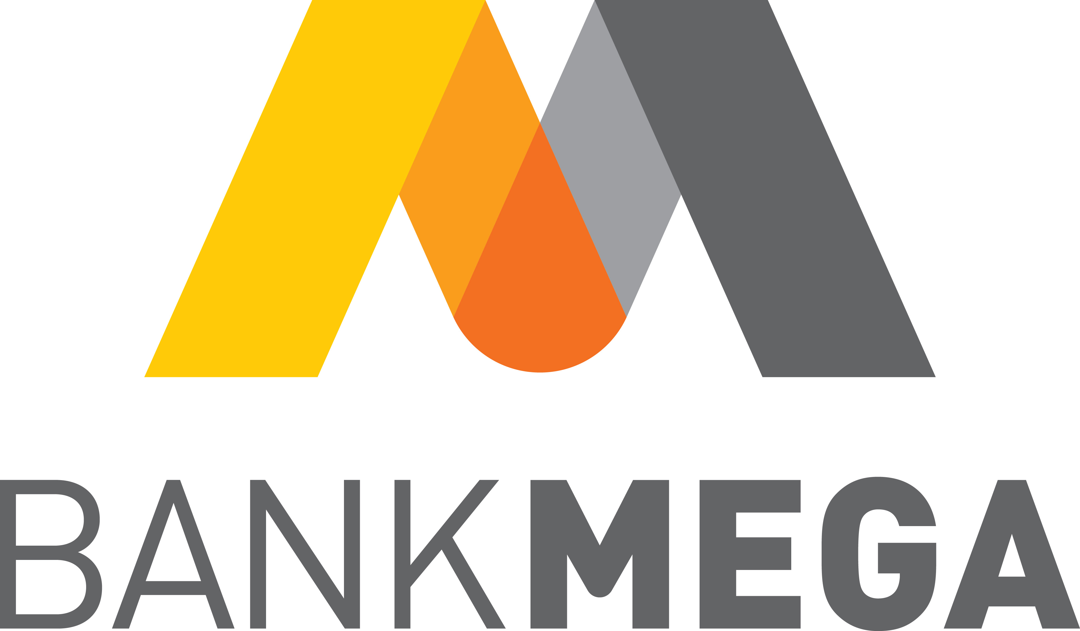
3. An Indonesia bank
H/T: Mumbrella
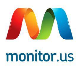
4. An American IT company
H/T: Mumbrella
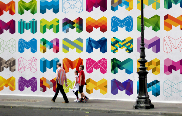
5. The City of Melbourne logo
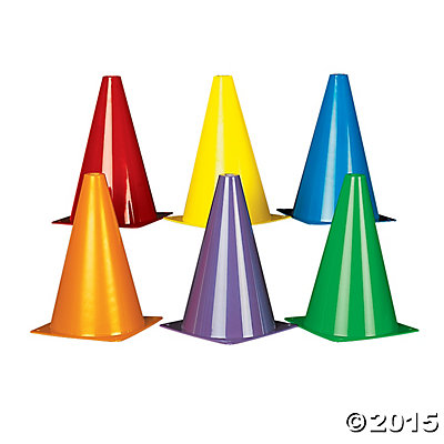
6. Cones
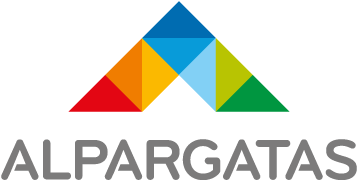
7. Half it and you get a Brazilian footwear company
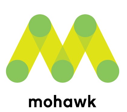
8. An American paper company
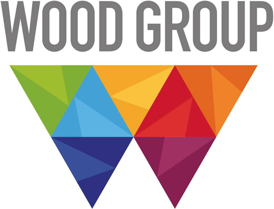
9. Turn it around and you get a UK oil and gas company
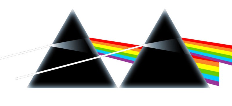
10. Two Pink Floyd albums placed side by side
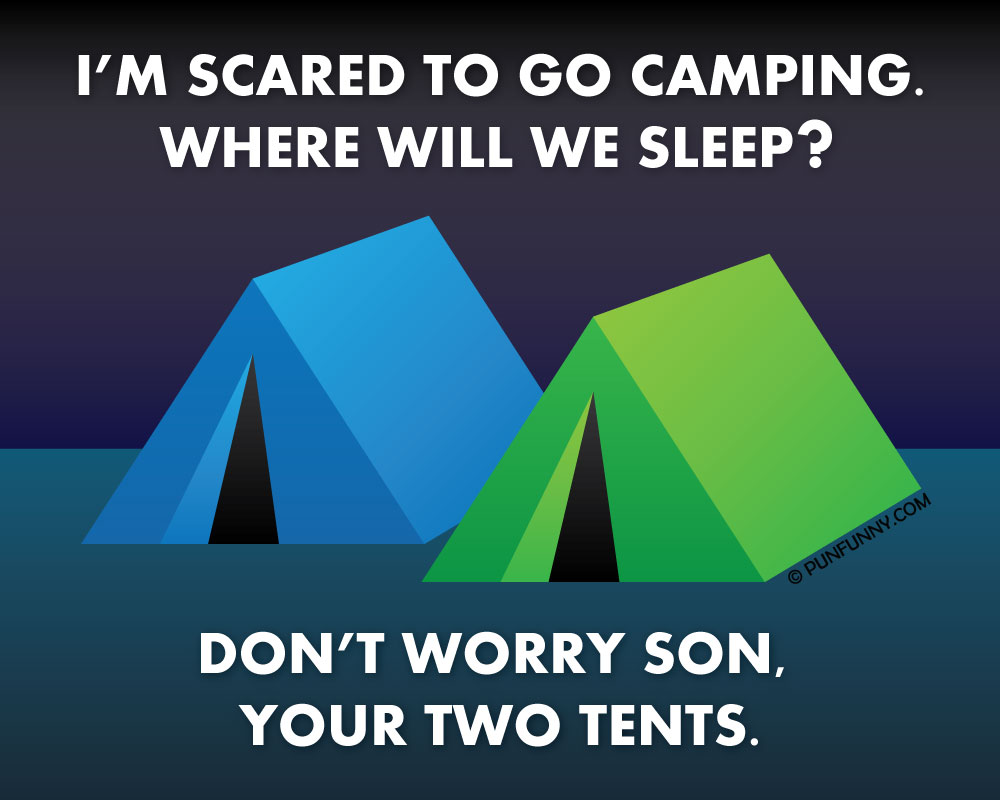
11. A result of being two tents?
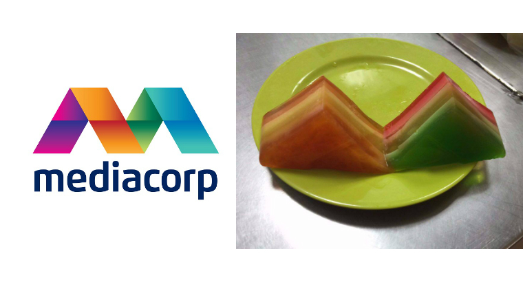
12. Agar-agar anyone?
If you like what you read, follow us on Facebook and Twitter to get the latest updates.
