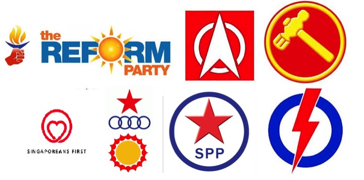
While the keyboard warriors of Singapore are merciless in judging every political candidate, designers in Singapore are no less forgiving when it comes to critiquing the party logos this GE2015.
Mothership.sg interviewed 7 local designers for their brutal honesty.
Reform Party
![]() Source: Reform Party
Source: Reform Party
Izyanti Asa’ari, 27, Designer (IZ)
The Reform Party logo, the party needs to see the value of simplification.
Lim Ming Ji, 32, Branding & Design Consultant (MJ)
Reform Party’s symbol of a sun talks about a new dawn. The logo comes from crowd-source contest. The way it’s designed, it’s new age where it incorporates text as part of a logo combined. It is not a strong logo. To be honest, it’s effectiveness is quite subjective.
Joshua Teo, 32, Director of Colony
Reform Party’s logo is an ugly one. It looks like food snack brand. The use of soft, vibrant colors makes it look a cookie manufacturer or someone who sells biscuits.
Koh Cheng Guan, 29, Art Director (CG)
The Reform Party logo has a lot of things going on that can be simplified. I don’t get the suns! Why is it 3D? This is too complex! They didn’t even consider the fonts. They’re too heavy.
Yanda, 30, Creative Director of Do Not Design (YD)
Reform Party’s visual identity catches everyone's eye and attention but doesn't secure any visual interest or distinction. The color choices and the color contrast, reminds me of one of the Bintan Lagoon Resort logo or the M1 colours. I won't be taking them seriously for sure.
Wilkie Tan, Designer (WT)
RP’s use of orange and blue is refreshing when compared to the mainly primary-coloured logos of other parties. Its logo too offers a degree of visual balance, with the placement of ‘the’ and ‘PARTY’ on either ends of it.
However it is puzzling as to why there is an inconsistency in the use of font size, capital lettering and even the need for ‘the’.
Imagine how Facebook would have sounded if you have to roll off an additional ‘The’ in front of it, hence RP’s logo is in itself a lesson in KISS (Keep It Simple Stupid).

Zed Tan, Designer (ZT)
Being the only party with an elongated logo might help the party stand out. But it also means that their logo is also the most awkward looking (not helped by the radial gradient that for some reason is also applied to the rays of the sun symbol in their logo)
SingFirst
 Political logo or ice cream brand? The struggle is real.
MJ: The SingFirst logo is a heart ala Walls ice cream logo. It’s almost a copy. Symbolically it reads that the party is soft and caring, which is not a bad thing. It suggests that the candidates caring, kind and soft-spoken people. However this doesn’t actually represent the hard driving party members. The logo is ok. But I don’t think it actually represents them or their values, hence the logo is weak.
CG: SingFirst IS Walls ice cream.
 Political candidate or ice cream uncle?
JT: The SingFirst logo looks like Walls ice cream. The logo is … I don’t know .. girly??? Cute??? It doesn’t do the party any favours in giving it credibility. It feels fluffy. The rounded aspect of the heart softens the hardiness needed in a party. A heart for a political party, makes it look like a wedding card emblem, restaurant or café. Not a political party.
YD: SingFirst? Bad name. Can't rap with it. Can't chant either. Walls ice cream anyone? It's probably the only design that feels current. But it suits more for a Kindness Campaign or the Courtesy Lion instead.
WT: The heartening thing is that they actually bothered putting up a description of what their logo meant with the emphasis of “thinking with their hearts in SingFirst”. Personally, I like the idea behind the logo, but it seriously needs a makeover if it is to earn some street cred.
ZT: I really don’t know what else I can say about this.
 How about … umm … nevermind.
Singapore People's Party

MJ: From my understanding Singapore Democratic Alliance is associated to Singapore People’s Party, Which is why if you look at it, the two logos are similar. So the SDA logo may be a derivation of the SPP logo.
CG: Singapore People’s Party looks imbalanced, being too heavy on the top. Reminds me of Dragonball. If the star is more centralized, it will be more balanced.
![]()
JT: Singapore Democratic Alliance is old school, looks like something from emperor Mao Zedong’s era. The star symbol makes it look like a communist logo.
YD: Singapore People’s Party is probably something that is done off Powerpoint or Word—with the old school drop shadow.

WT: The current SPP’s logo no longer has to contend with netizens’ charges of it looking like Caltex’s logo.
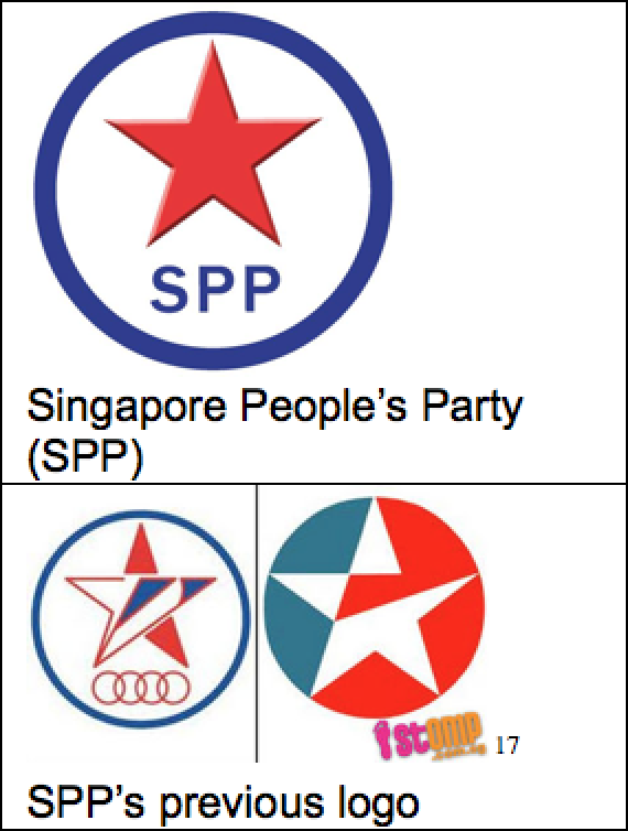 Comparison provided by Wilkie Tan.
Singapore Democratic Alliance

MJ: Singapore Democratic Alliance, these Olympic circles are very dated. It looks old. It is not striking and the meaning is not very strong. I’m not sure what the meaning is to be honest. The circles could be mean something along the lines of parties combining and coming together.
JT: National Solidarity Party logo is not meaningful to me whatsoever. I don’t know what the stand for.
CG: The Singapore Democratic Alliance is like a Heineken meets AUDI logo. It looks too similar to commercial brands.

We do not endorse drinking and driving during Colling Off Day or any day.
YD: Singapore Democratic Alliance's identity concept is made up of a star and four circles where it's making a connection between the party and its people. The star is supported and held up by the four circles stuck side by side with one another.
National Solidarity Party
![]()
MJ: The National Solidarity Party logo, if I’m not wrong, is a compass. I think it’s a good logo that symbolizes finding direction.
JT: National Solidarity Party logo is not meaningful to me whatsoever. I don’t know what they stand for.
WT: Without a description of their logo on the party site, one can only guess that it may be a symbol of the North Star. The North Star or Pole Star was used a guide for early travellers. Slaves used the North Star as their guide to the free states and Canada. Hence one may read that NSP aspires to be a guiding light for their electorate.
ZT: NSP’s logo borrows the metaphor of the compass, which implies directedness and a certain knowledge of where they are going. But the longer I stare at it, the more the NSP’s logo appears to waver on what it actually wants to be. It’s pointy visage, while borrowing the emphasis on the cardinal (North, South, East, West) points of the compass, also hints at celestial imagery.
YD: National Solidarity Party …
 Neither do we.
Workers' Party

IZ: Singaporean parties try to come off as friendly, which all brands try to do. This unfortunately doesn’t look credible towards governing potential. At the same time, there’s a danger of looking too aggressive. For example Workers’ Party and Singapore Democratic Party, with its’ use of color. The use of the colors comes off as aggressive. I don’t know whether aggression is a tone that should be used for our generation.
MJ: The Worker’s Party logo has a lot of deep meaning. It is derived from the socialist movement with communist influence. The communist symbol is hammer and sickle, but the Worker’s Party only used the hammer symbols. The hammer represents workers. The red and yellow colors are similar to communist colors, and that’s why later on, Worker’s Party added blue (for blue collar workers). This moved helped to move the party away from appearing to be communist. If you notice, their flags are red. Those were from the old days. They might seem to be socialist but I don’t think they have communist ideals. The logo is impactful. The hammer is a strong symbol of determination.

JT: The Worker’s Party logo goes hand in hand with the party values. The use of a hammer is synonymous with workers and in contrast builders. Overtime it looks like Thor’s hammer. However I think the logo is dated and old school.
CG: Workers’ Party logo is too complexed for a simple logo. This 3D and beveled look is just too complex.
YD: The hammer in Workers’ Party logo seems to reference the communist era in Russia. It is very dated and irrelevant. Red and yellow on their logo and light blue for their uniform?
WT: The Workers' Party yellow hammer of the people, inscribed within another unity (unity for the working class) ring, has not changed much since 1957. There were however slight noticeable updates in recent years, as seen in the simplification in the hammer and the emboss applied to both the hammer and the ring. It is a much beloved symbol for its large base of supporters and like PAP’s tweaks to the logo have to be a measured affair. I would certainly do no more than retaining the striking yellow, crop the hammer and do away with the emboss to just update the look for the next fight.
 Ah good suggestion mate!
ZT: The drawing of the hammer also raises a few questions for me. For instance, what sort of hammer is it? It is neither a claw hammer, nor does it seem like one for heavy duty use. I take issue with this because it is clearly a case of non-functional design.
Singapore Democratic Party
![]()
IZ: Like the Workers’ Party, Singapore Democratic Party’s use of color comes off as aggressive. I don’t know whether aggression is a tone that should be used for our generation.
MJ: Singapore Democratic Party is also a compass. But unlike NSP, the arrow is north. It’s a strong logo, with a very definite color, clear shape, and clear meaning of moving forward.
JT: Singapore Democratic Party logo has strong colors. It’s simple and effective. It’s more comfortable to look at however it looks like a civil service logo for the fire department of Civil Defence.
CG: Singapore Democratic Party is simple. It’s ok.

YD: Singapore Democratic Party makes me feels like it's a first few drafts of the Toyota logo somehow. If not, it feels like a compass pointing north. If it's neither an arrow, nor a compass, then I won't know what it is or stands for then.
WT: It certainly looked modern when launched in 1980, but it has lost some of that shine over the 35 years since its inception. Similarities between it and the beloved Star Fleet Command (Star Trek) logo are obvious but using it as an inspiration for further tweaking may not be the best idea.
ZT: The Singapore Democratic Party’s logo is, like the PAP’s logo, a clear and concise duo-tone. No awkwardness, no fuss. Candidates have referred to it as a rocket, so the upwards arrow implies progress in more ways than one.
People's Action Party
![]()
IZ: The only reason why the People’s Action Party logo works is because we have been exposed to it the longest. Color-wise it’s balanced, because of it’s use of warm and cool colours.
MJ: The People’s Action Party logo uses a lot of symbolism. From the logo, the audience associates the party with being powerful, fighting fast. It associates well with the name of the party. It’s reads as the kind of party that takes action, is responsive and decisive because lightning means a concentration of all power. Overall it’s a good logo. It’s the best logo.
JT: The PAP has been around for a long time so the symbol is synonymous with the party. Consider the time in which the logo was formed. The logo represented action, efficiency and power to make actions, which was information that needed to be communicated at the time of it’s formation. Today, the logo comes off as aggressive. People say “you will get struck by lightning”, and metaphorically, you won't know what struck you. There are a lot of tense connotations to it.
 Maybe not that violent, can?
CG: People’s Action Party logo is the most professional and is the cleanest.
YD: The PAP tweaked their logo recently. The lighting is longer now or rather they have made the circle smaller so it doesn't feels so empowering. And the corners and edges of the lighting icon have been smoothen out. It’s no longer sharp. The lightning symbol suggests that they are powerful? Have no empathy? This is what I read from a lighting symbol.
WT: Visually, the primary red bolt offers a good contrast over the thick primary blue ring. In fact, the blue ring’s median thickness in relation to the bolt’s is almost the same. With a successful brand of politics that the PAP has built over the past decade, one may argue that it would be foolish to fix something that is perfectly running. Should a rebranding exercise occur, perhaps a slight tilt, losing those pointy corners and some tapering on the ring may offer a safe tweak for a post-GE15 PAP.
If you like what you read, follow us on Facebook and Twitter to get the latest updates.
Click here to go to our GE2015 microsite for the juiciest election-related news on Mothership.sg.
If you like what you read, follow us on Facebook, Instagram, Twitter and Telegram to get the latest updates.