If you’re into big data, politics, and nerdy statistics, here's something you can sink your teeth into: a one-stop portal offering pretty much anything you might want to know about Singapore's 12th Parliament.
And even if you're not, its makers say it was designed with the average (interested) voter in mind, too.
Developed by a team of post-graduate Masters in Information Analytics students in Singapore Management University (SMU), the site allows every Singaporean to see a simplified version of the complex processes that occur in Parliament.
It offers several tools that help a user assess individual MPs and their interactions with other MPs, — it features everything that was said and done during the 12th Parliament session (we are now at the beginning of our 13th Parliament session, by the way).
Here's a look at one of their tools in action:
 Gif from here
Notice the word, Hansard, that had appeared several times in the GIF?
The Hansard is essentially the official meeting minutes of Parliament — it chronicles everything every single MP has ever said in Singapore's parliament, from the day we started having parliamentary sessions. (Like really. Even the Legislative Assembly in 1955.)
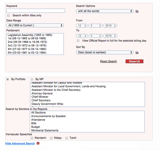
But the clunky mass of data and text — which you have to search painstakingly for using the tool, captured in the screenshot above — was limited to certain filters, such as responses by ministers or portfolios, or responses by MPs.
One of its three creators, 31-year-old Michael Ng, said the project started with the question of how one can look at information from the Hansard to find out how his or her incumbent MP "performed" during the 12th Parliamentary term.
“We wanted to (look at) how do I gauge whether someone in my constituency — who’s running, how good (he is),” Ng said.
And well, heck, yeah — to say one would have to do "a lot of homework" in scouring the Hansard is an understatement if there ever was one.
How the tools work, and what they do
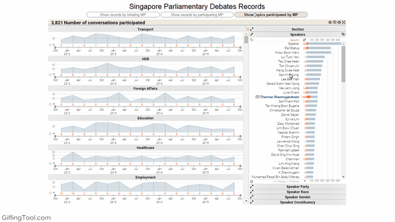
There are four forms of visual analyses in the microsite — a conversation browser, where topics and exchanges are analysed, network graphs, co-occurrence tables and hive plots.
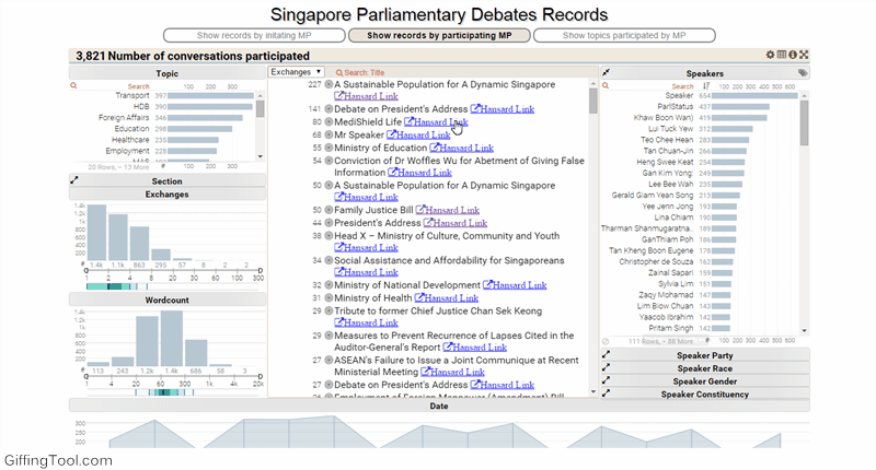
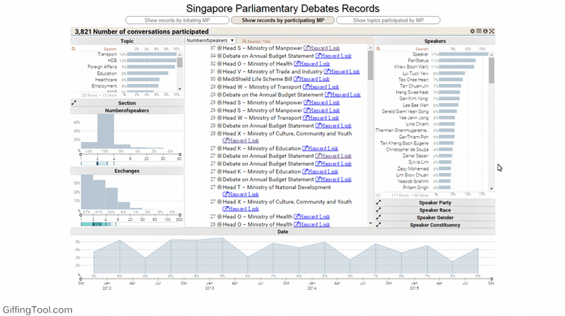
Conversation browser
 Gif from here
This browser also allows people to compare topics discussed between two or more MPs, or to show exchanges started by certain MPs.
The tool also groups topics together though preliminary machine learning — topics are grouped independently by the computer, rather than by labels provided by humans.
Thus, transport issues would be grouped — exchanges about the MRT will be grouped with buses, cars and roads.
From here, you can see how often topics were brought up by MPs or speakers in the last Parliament:
 Gif from here
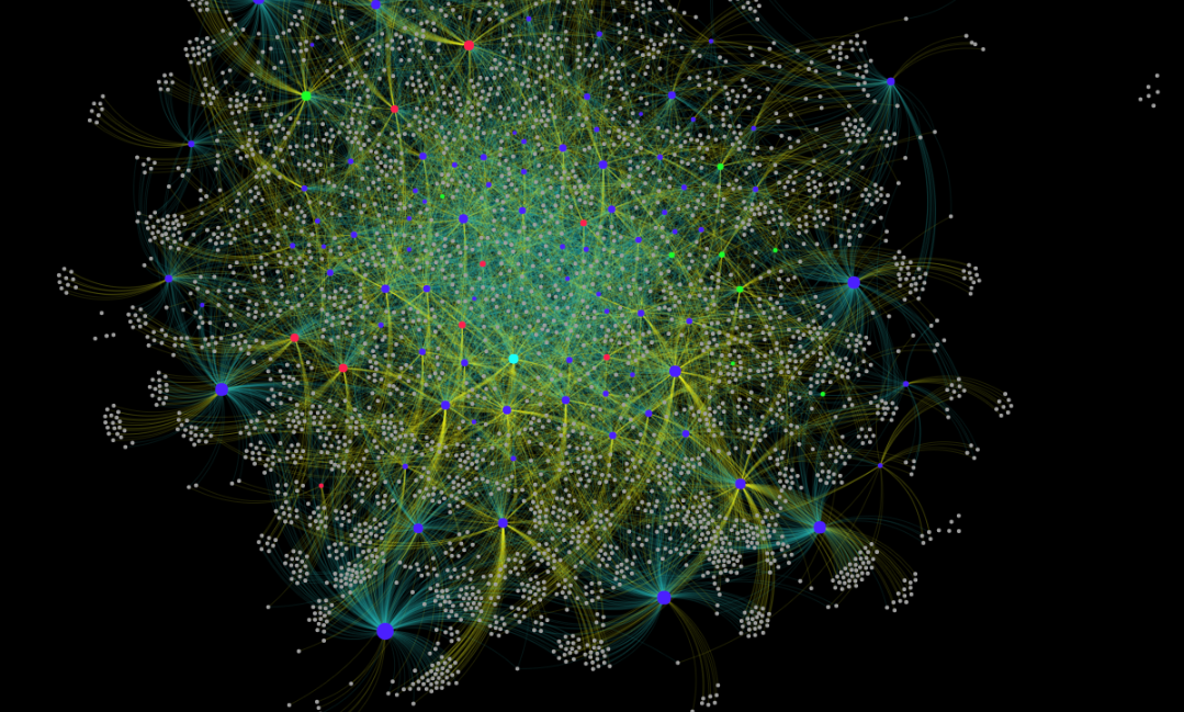
Network graphs
A network graph connects a node — in this case, the MPs or the exchange they had — with other MPs who have had the same conversation. They are grouped by communities — which may be related by topic.
Conversations here refer to exchanges recorded on the floor of Parliament, be it in written responses or oral discussions (There are two forms of parliamentary questions and replies - oral and written).
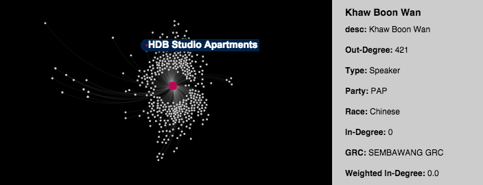
For example, Khaw Boon Wan (the red dot in the centre), the Minister for National Development from May 2011 to Sep 2015, would have participated in most housing related topics.
Thus, his conversations (represented by the grey dots) will be in one ‘community'.
Not all conversations in his community will be about housing, however — some may be about the Population White Paper, or other major Parliament debates that saw participation.
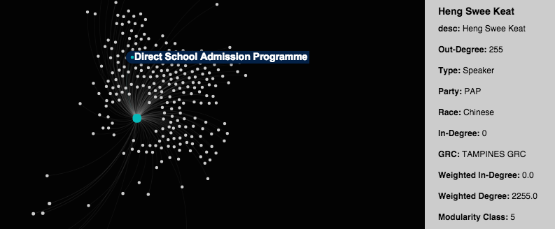
And Heng Swee Keat (the blue dot), the Minister for Education for the same period, would have participated in most debates (the grey dots) involving education. Like Khaw, Heng’s ‘community’ might not just revolve around education.
The closer an MP is to the centre of the graph, the more connected he/she is with various different topics.
If you click on the MP’s node, you can see the topics he or she has participated in — the wider the spread, the greater the bove of topics he or she has participated in. Take for example former Non-Constituency MP Lina Chiam and David Ong, who recently resigned:
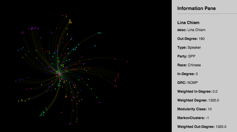
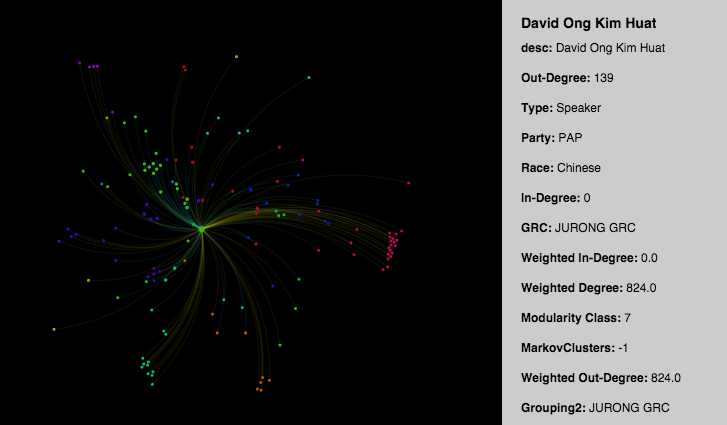
The colours here refer mostly to the ‘communities’ of conversations each speaker has participated in. Edges — the lines between conversation nodes and speaker nodes — are divided into yellow for ‘started’ and blue for ‘participated’. Colour temperature is used to determine the level of participation.
We can see from the two graphs above that Chiam participated in 190 conversations, while Ong participated in 139 conversations. We can also see that Chiam started 109 conversations, as compared to David Ong’s 84, and participated in more ‘communities’ than Ong.
"But generally what we try to do here is that at least the person who started it (the conversation) has some initiative — that’s the differentiation we want to make,” he added.
Hive plots
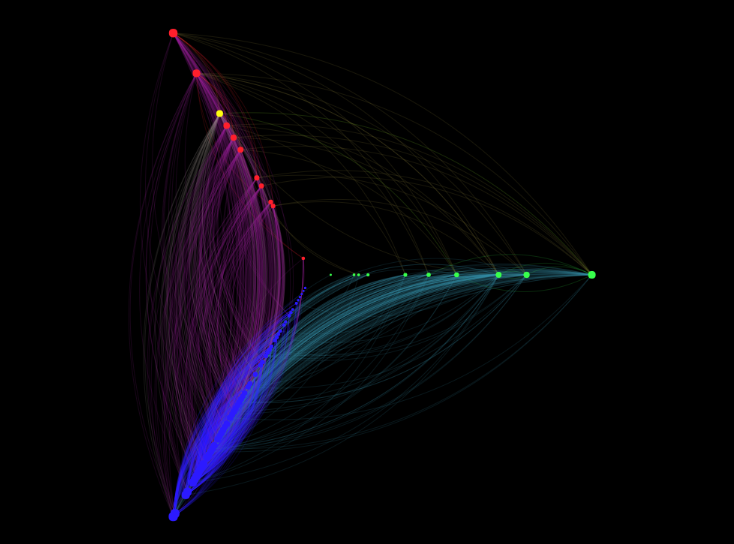
This determines relationships between different groups of people — in this case, Opposition MPs (red and yellow) the NMPs (green) and PAP MPs (blue).
Again, with the network graphs, a connection indicates that two MPs have engaged in a conversation, be it a written question or an oral query).
As you can see from above, it looks like Opposition MPs and NMPs hardly talked to one another.
Even rarer were inter-Opposition and inter-NMP interactions, as shown in this six-axis hive plot:
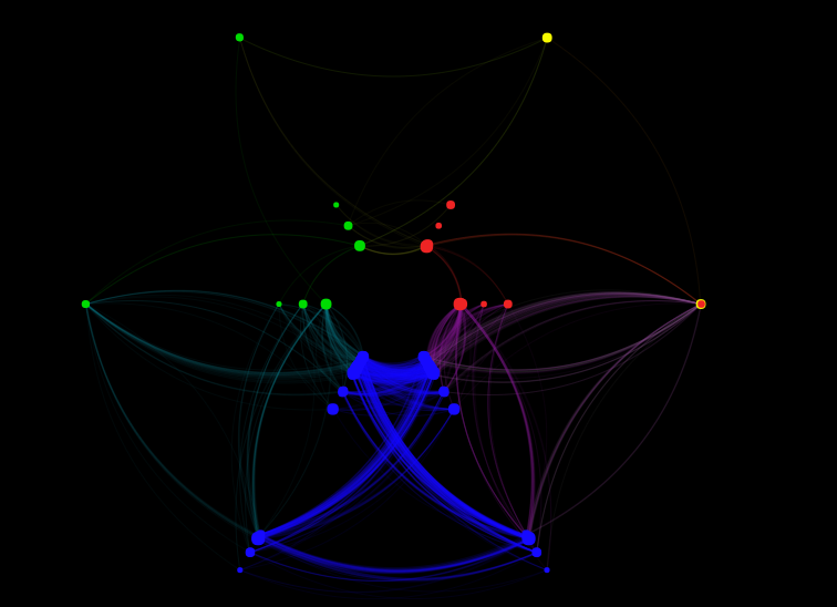
The six-axis hive plot is just the three party hive plot duplicated to show intra-group interactions.
The plots show that there are more inter-party interactions within PAP members than there are for NMPs or opposition MPs. This is natural, given that the number of PAP MPs are greater; it’s also normal that there are fewer interactions between Opposition and NMPs, since neither are in power or know more about government functions.
So what would a hive plot show? It "simplifies the connections and allows us to see which group has more connections with another", said Ng.
He added that it would be hard to see this relationship in a big network graph.
Co-occurrence tables
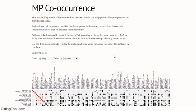 Gif from here
The table helps indicate if one MP has interacted with another in at least one conversation. The darker the cell, the more times two MPs have spoken to each other in Parliament.
By default, the cells are coloured by party (orange for the PAP, green for the NMP, red for the WP and SPP), but the cells can be sorted by many other variables, such as race or the constituency the MP belongs to.
The table allows users to see any patterns that may be in the interactions — whether one group interacts differently with another.
What's gonna be done with this?
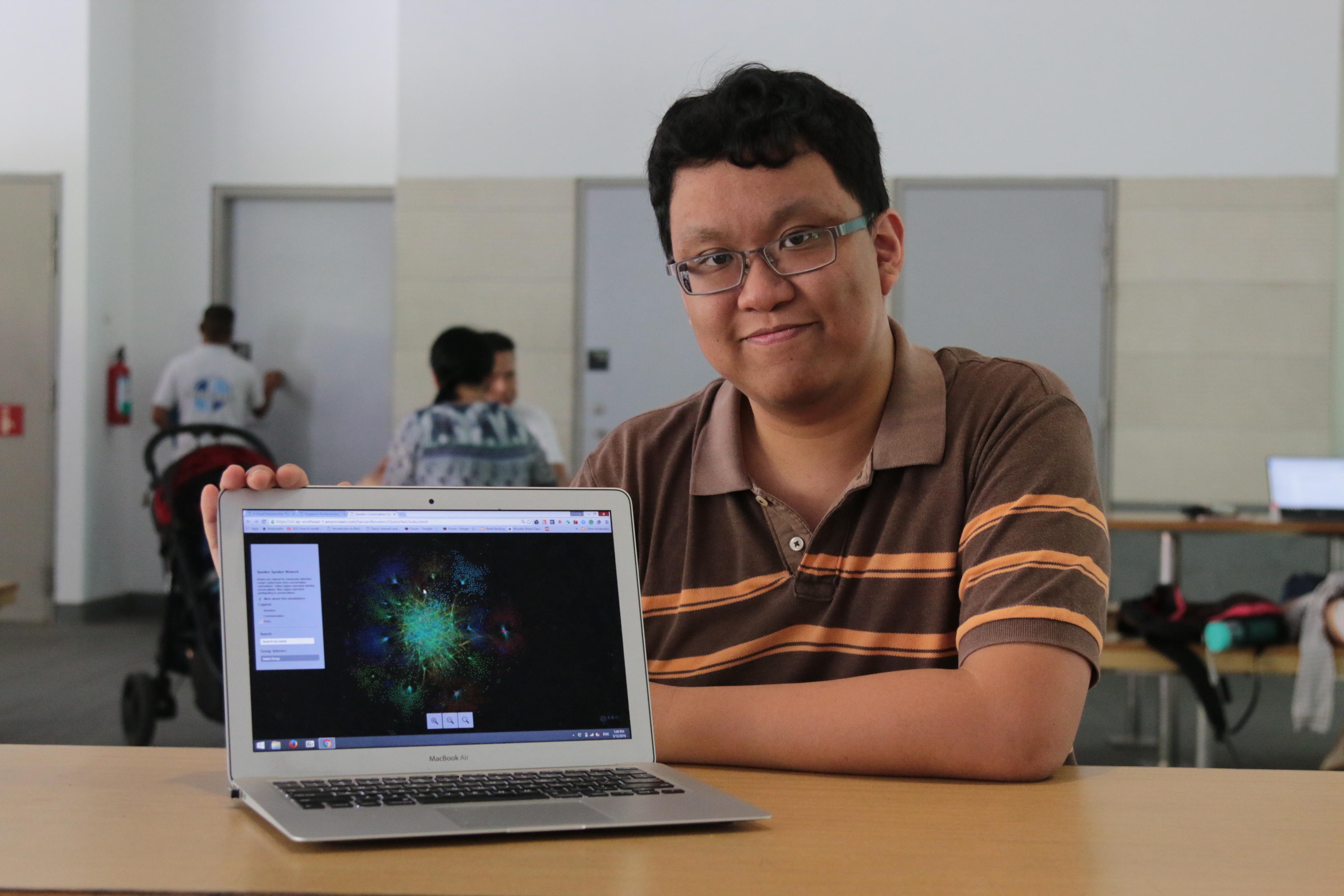 Photo by Ng Yi Shu
Ng’s team hopes to have this adopted by the Parliament as a new way to navigate the Hansard — and also to facilitate information-gathering for anyone who might be looking for it.
"The way we see it is that you need to get people interested,” he says. "You can’t (just) say that the data is there, you need to look for it, but it takes 5 hours or 2 hours to get what you want.”
That said, the data is presented very much as an entry point — every entry comes with a link to the relevant Hansard transcription of what was said.
"We are not trying to force any perspective, but at least we make it easier for you to research and find the exact truth,” Ng adds. “You need to look at the full context of these conversations.”
Top photo from here.
If you like what you read, follow us on Facebook and Twitter to get the latest updates.
If you like what you read, follow us on Facebook, Instagram, Twitter and Telegram to get the latest updates.